Logo design Perth women's aid
Perthshire Women's Aid
Perthshire Women’s Aid came to us with a great new logo concept that they had designed.
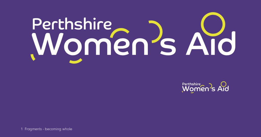
While developing their website design it was decided that the metaphor of fragments becoming whole wasn’t clear when the graphic elements were used without the text and we were happy to undertake further logo development. It’s probably worth mentioning that we enjoy designing logos.
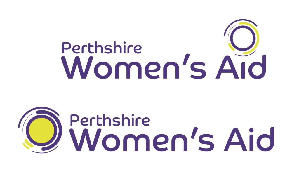
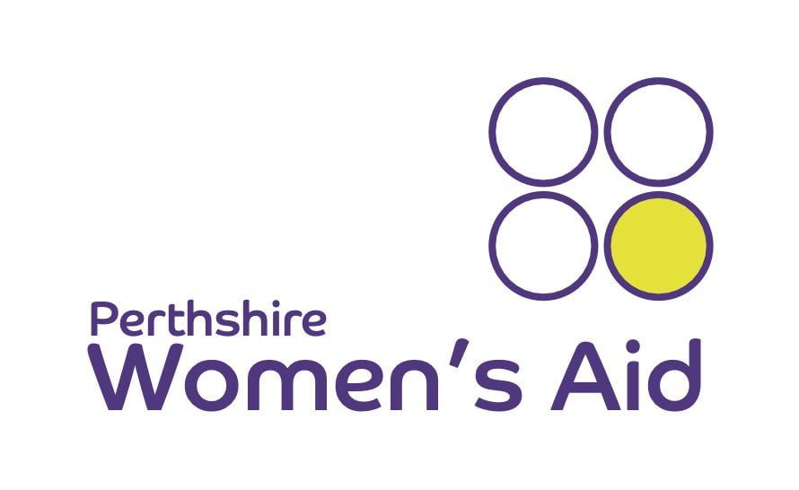
We created some new compositions, sticking to the theme and preserving the strong font and colour choices.
The end result is a versatile and recognisable combination of icon, font, and colour, that can be used consistently on anything from the small icon on a website tab or profile picture to uniforms and printed media.



More of our work
- All
- Communications
- Featured
- Portfolio
- Web Design & Development


